I had several artwork ideas that I found interesting and also believed would work successfully on my digipak. I researched in order to find examples of artwork that
replicated my idea.

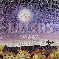
A picture mosaic consists of hundreds of tiny pictures which together make a mosaic/collage of a bigger, primary picture. It was made most famous by Leon Harmon in 1976 with his famous 252 grey shaded tiles to create the face of Abraham Lincoln. This technique could be used on my album to represent the many faces of love, a subject that the songs on the album would surround. If I was to use this idea, I would have a picture of the band, perhaps made up of tiny pictures that connote to love e.g. roses, hearts. I believe that using this technique rather than a simple picture structure, an added edge is given to the artwork, intriguing people to the album and looking at the deeper picture. The Killers, a band who could perhaps be considered similar in genre to The 99's, used a similar artwork idea for their album, 'day and age'.


I looked over past artwork used by the artist of my song and noticed that they like to use a cartoon/comic effect for their album covers (see right). Using a simple comic book effect on a picture taken on my laptop (see left), I realised that the effect and meaning behind the picture could arguably symbolise the meaning I am attempting to portray. The comic book feel that is given to the picture suggests a surreal side to love and relationships - a topic that I believed is raised in both my music video and also on the album as a whole should it ever be produced. The art known as 'pop art' originated in Britain and America during the 1950's and 1960's. It has been perhaps made most popular by Andy Warhol in his infamous artwork of Marilyn Monroe and also Roy Lichtenstein in his comic book strips (see below) I have researched into an edit technique used on photoshop which would enable me to achieve a high-quality standard of this effect.
Polaroid photography is often associated with love and has been used to represent this theme in many media products. I felt that this classic connotation of love and relationships could be used to good significance for artwork on my digipak. As well as this, photographs in general show memories - this theme is hugely relevant and arguably most important in the music video I produced where flashbacks are used several times. I own a polaroid one600 camera which could be used for various uses if I chose to go ahead with this idea. It would give the artwork authenticity as well as creating a higher sense of self-achievement. It would enable the artwork to look more realistic than just creating a border of a polaroid frame on photoshop.
In my music video, the location played a huge role. Cromer beach and pier I felt was really brought to life with a wide variety of camera effects and angles focusing on many aspects of location. I feel that it is vital to include a location shot somewhere on my album artwork and I believe that the inside double-page spread would be perfect for this. A landscape view of Cromer with an enhanced picture using photoshop would reinforce the huge role that this location played in my music video. As well as publicising the single video as well.
Although a big part of me wants to go crazy with my artwork and be incredibly creative, I do not feel that this would be reflective of the type of music I have been working with or the band itself. I want to keep editing techniques and effects to a minimum in my video in order to focus on the content itself as my video is narrative based and the story proves more important than any kind of effects used. I will try to replicate this in my album art work and magazine advert. I want to focus on getting an amazing image rather than using all kinds of effects - much like in my music video. I am going to stick to simple images of the band and of certain locations with my artwork.


No comments:
Post a Comment