Tuesday, 26 February 2013

flashbacks

I intend for my music video to contain many flashbacks. In order to gain an in depth understanding of what works well and not so well using this technique, I researched other music videos that use this theme - I found a song by Calvin Harris 'flashbacks' that, although different in genre, uses sismilar techniques to what I am aiming for.


I found that on several occasions when a flashback is used, the camera is handheld. This shows slight disorientation as the camera is less steady and a signification of 'looking back' is portrayed. This also differentiates between the present and past.


In order to further emphasise this contrast I may use black and white effect which will juxtapose with the bright colours of the beach - which is where the music video will be primarily set when flashbacks are not used.


A classic association with a photograph is memories and Calvin Harris uses this idea in his video. He looks back at photos from what we assume to be the night before and the mis-en-scene then transforms to the moment itself. I hope to achieve this in my video also; the main character will be burning photos taken throughout his relationship and the mis-en-scen will cross cut to that moment in time.


Monday, 25 February 2013

Front panel edits

I have shortlisted three different edits of my front panel in order to gain feedback and decide which one works best in displaying genre and characteristics of both my band and the music they produce.
I spoke to both my teachers and fellow students in order to receive numerous comments on each and ultimately, make a decision for the front cover of my digipak.


Black and White

I received a mix of both positive and negative feedback for this draft. The black an white effect gives the image a 'gritty' feel which I could argue is the path my band could take. The lack of colour can also be referenced to the various black and white shots in my music video when flashbacks occur.
On the other hand, this effect cancels out any link to happiness which is a connotation of love. Perhaps I would be hugely contradicting myself by printing this panel in black and white because the album surrounds the topic of love.


Enhanced Colour

With this image I have enhanced colour and lighting to attempt to make the photo more eye-catching. Although teachers have responded to this positively, fellow students, whom I could argue play role of target audience for my video, have mentioned that the image now looks unnatural and the effects are unnecessary.
I decided to listent to my class mates on this one and decide to strike a balance between an enhanced image and a more natural one. The primary purpose for a music video is to reach out to it's target audience and I felt that by listening to the collective voice of my class (target audience) this purpose would be fulfilled.


Original

In the end I decided to go with an image much similar to this one because it is a plain and simple image and I felt this fits well with the theme of my album altogether. Although I have used some editing and enhancing tools on this image, I have not gone over the top because I did not want the image to gain an unnatural or abstract feel. Successful bands such as Coldplay have used album artwork much similar to this and I feel that a simple photograph can sometimes show and say much more than complex artwork.

Mods and Rockers - How subcultures have changed

We have recently been researching and analysing two specific youth subcultures of the 1960's known as 'mods and rockers'. These groups are two I have shown a particular interest in due to my love of the film 'Quadrophenia' by Franc Roddam which circulates the lives of youths belonging to these subcultures. As well as this, we have attempted to understand the dramatic change in subcultures through time.


The mod subculture of the 60's was generally centred around fashion and music. Cleancut outfits such as suits were the trademark - this particular stereotype has been inherited from the fashion of Teddy Boys of the 1950's. The music of the group was mainly sole, rhythym and blues, although ska and beat also regularly featured. The youth group were also very often stereotyped to ride scooters.


Rockers on the other hand were much the opposite. Protective clothing such as jet black leather jackets and motorcycle boots were the norm for this subculture. The common rocker hairstyle was known as a pompadour, which originated and was later associated with 1950s rock and roll which, not so coincidentally, was the rockers' main choice of music genre.


Both subcultures saw one another as 'rivals' and would even go to the extreme of riots in order to determine their superiority over one another. 1964 stimulated the beginning of what was know as 'moral panic' due to the riots that took place in seaside resorts of southern areas such as Margate and Brighton. The riots emulated across the world after the media invested in the stories. Front pages of newspapers were took up solely of pictures and headlines surrounding the riots. In 1972, Stanley Cohen wrote a book, 'Folk Devils and Moral Panics', on the topic of the 1964 riots.


The extremes that both 'groups' went to during this time, along with the media attention it received, highlights how important a culture could really be to a person. It was what their life circulated and their entire behaviour would be affected by the group that they were a part of.
Nowadays, things are very different. In the 60's, mods and rockers dominated Britain's cultural world as the only two main 'ways of life' whereas today's society see's so many different subcultures that it would be impossible to name each one by memory. Indie, Rock, Emo, Hipster - just four examples of what we understand today to be 'cultures'. However, when compared to what this meant 50 years ago, it seems as though the meaning has been lost. Every aspect of behaviour in everyday life was determined by which culture you belonged to - it was almost like a religion.

Monday, 11 February 2013

Digipak hard copy draft ideas


Comic book effect

Ripped photograph

Sketch

Notebook

Artwork ideas

I had several artwork ideas that I found interesting and also believed would work successfully on my digipak. I researched in order to find examples of artwork that 
replicated my idea.


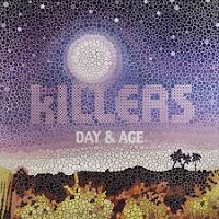
A picture mosaic consists of hundreds of tiny pictures which together make a mosaic/collage of a bigger, primary picture. It was made most famous by Leon Harmon in 1976 with his famous 252 grey shaded tiles to create the face of Abraham Lincoln. This technique could be used on my album to represent the many faces of love, a subject that the songs on the album would surround. If I was to use this idea, I would have a picture of the band, perhaps made up of tiny pictures that connote to love e.g. roses, hearts. I believe that using this technique rather than a simple picture structure, an added edge is given to the artwork, intriguing people to the album and looking at the deeper picture. The Killers, a band who could perhaps be considered similar in genre to The 99's, used a similar artwork idea for their album, 'day and age'.


I looked over past artwork used by the artist of my song and noticed that they like to use a cartoon/comic effect for their album covers (see right). Using a simple comic book effect on a picture taken on my laptop (see left), I realised that the effect and meaning behind the picture could arguably symbolise the meaning I am attempting to portray. The comic book feel that is given to the picture suggests a surreal side to love and relationships - a topic that I believed is raised in both my music video and also on the album as a whole should it ever be produced. The art known as 'pop art' originated in Britain and America during the 1950's and 1960's. It has been perhaps made most popular by Andy Warhol in his infamous artwork of Marilyn Monroe and also Roy Lichtenstein in his comic book strips (see below) I have researched into an edit technique used on photoshop which would enable me to achieve a high-quality standard of this effect.


Polaroid photography is often associated with love and has been used to represent this theme in many media products. I felt that this classic connotation of love and relationships could be used to good significance for artwork on my digipak. As well as this, photographs in general show memories - this theme is hugely relevant and arguably most important in the music video I produced where flashbacks are used several times. I own a polaroid one600 camera which could be used for various uses if I chose to go ahead with this idea. It would give the artwork authenticity as well as creating a higher sense of self-achievement. It would enable the artwork to look more realistic than just creating a border of a polaroid frame on photoshop.


In my music video, the location played a huge role. Cromer beach and pier I felt was really brought to life with a wide variety of camera effects and angles focusing on many aspects of location. I feel that it is vital to include a location shot somewhere on my album artwork and I believe that the inside double-page spread would be perfect for this. A landscape view of Cromer with an enhanced picture using photoshop would reinforce the huge role that this location played in my music video. As well as publicising the single video as well.


Although a big part of me wants to go crazy with my artwork and be incredibly creative, I do not feel that this would be reflective of the type of music I have been working with or the band itself. I want to keep editing techniques and effects to a minimum in my video in order to focus on the content itself as my video is narrative based and the story proves more important than any kind of effects used. I will try to replicate this in my album art work and magazine advert. I want to focus on getting an amazing image rather than using all kinds of effects - much like in my music video. I am going to stick to simple images of the band and of certain locations with my artwork.